Assignment 4 – Real or Fake
My approach to DPP assignment 4
The objective of this Assignment is to produce a
photographic image to illustrate an imaginary book or magazine cover.
Since the covers of books and magazines are sales vehicles
for their contents, the covers of such items are subject to wide interpretation
by art directors, illustrators and photographers. Should the book give an
indication of the story, should it help the reader visualise an element within
the story or is it simple, or should I say the complex marketing skills used to
draw a potential buyer to this particular book for no reason other than the
cover and its genre.
Whether the book is fiction or fact can quickly determine
if the book cover image itself is fiction or fact or at least which camp the
majority of its cover design will fall into
I thought I’d take a look at a few book covers to get a feel
for what sort images are used for books about fiction:

Styles, colours, layout all seem different across this small
selection. If there is a winning design its not yet been identified! I suspect
there never will be.
No doubt an established writer will be selling books based
upon their popularity; whilst book covers no doubt help, in the case of JK
Rowling and her Harry Potter series then it’s unlikely that the book cover
contributed much to each book's popularity, the writing did the talking. That
said for some of the books I saw there did seem to be two covers aimed and
children and adults. However for less popular or new authors then how can they
encourage the reader to take the first step, how does the book cover attract a
browser? Well the cover of this book attracted me even though I knew nothing
about the author:

I expect that there is much science behind book covers and
the question of ethics regarding whether an amount of digital manipulation has
been used to create the cover of book of fiction is not something worried
about.
For my book cover I decided that I would create something
that initially started simple but would strike a chord with the browser and
have some hidden complexity and something not quite visible at first glance. In
addition I want this book to stand out on the book stand and its colour to help
achieve this and at the least encourage the browser to pick up the book and
have a look inside. After this then the writing inside must take over, the
cover has done its job.
Some time in the past I had wanted to create a fun image
where I could duplicate a subject with a view to misleading the viewer. I
initially got the idea from a website called Photoextremist where the author,
Evan Sharboneau gives tips and demonstrations about photo manipulation. His
image below whilst excessive looked fun:

In this image he got his mother to take multiple images of
himself with the camera on tripod where he later processed the multiple images
into a composite.
At the time this image by Evan inspired me to create a
composite of my own which at the time I posted on a social website claiming it
to be an image of my triplet daughters where as it was my oldest daughter
making several poses which I captured with a camera on a tripod. For those that
ask its water in an empty beer bottle for extra effect and questioning from the
viewers even though she is beyond the legal age:

So this started me thinking of an image where I could
capture multiple instances of the same person.
Michael Sacasas has an interesting blog and put together an
interesting post regarding combining a remembrance to the D-Day landings and
places having memories and follows a similar theme to that I posted a few weeks
earlier.
This post can be found here but it’s this image in part that
gives further reference:

The combination of images across time is very powerful and serves as
reminder of how things change and how it will continue to do so long after I
have gone. Perhaps someone will use one of my images 70 years later.
These
images have given me suggestion and ideas of how to approach assignment 4.
Assignment 4 Workflow and Images
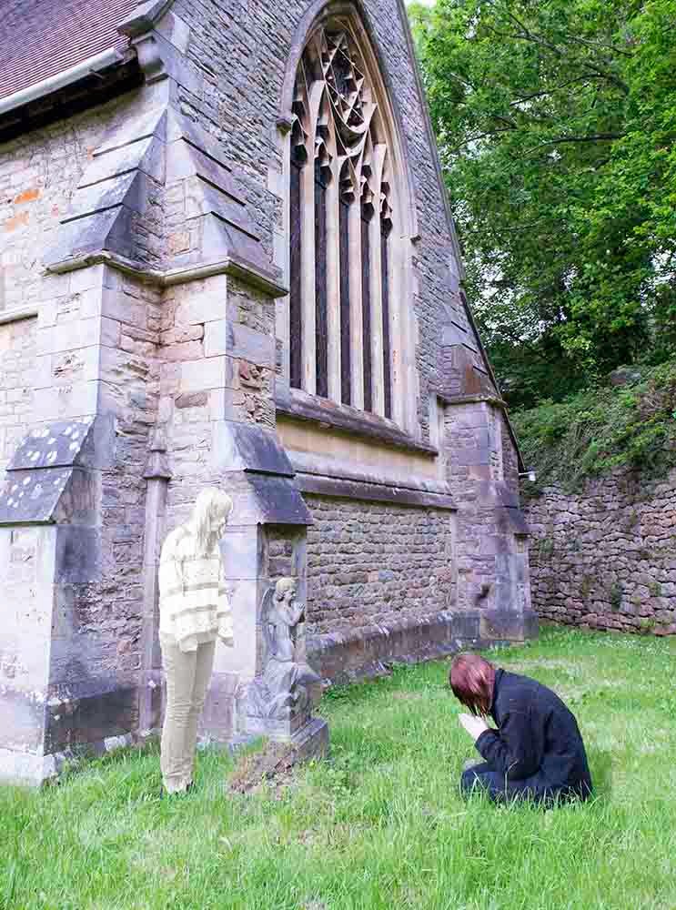
I decided on the scene which would be at Lydbrook Church where a number of graves existed. My pre-visualisation was to create on image of a child praying at the side of a grave with a spirit version looking down at the praying child. For this image I wanted both subjects to be the same person but appearing as if twins. To avoid causing an possible offence to anyone I selected an old grave where the deceased had long since passed and in creating the image was very careful not tread anywhere that could be mistakenly seen to offend and was also set-up so as to ensure no names were captured in the image. Had this been for a real book cover I would considered seeking permission from a relative if they existed to ensure it wouldn’t cause offence if recognised.
I decided on the scene which would be at Lydbrook Church where a number of graves existed. My pre-visualisation was to create on image of a child praying at the side of a grave with a spirit version looking down at the praying child. For this image I wanted both subjects to be the same person but appearing as if twins. To avoid causing an possible offence to anyone I selected an old grave where the deceased had long since passed and in creating the image was very careful not tread anywhere that could be mistakenly seen to offend and was also set-up so as to ensure no names were captured in the image. Had this been for a real book cover I would considered seeking permission from a relative if they existed to ensure it wouldn’t cause offence if recognised.
I planned the shoot for Saturday afternoon when the church
was closed to minimise any disruption. I took a multitude of shots both
landscape and portrait composing the images in pairs where my model was both
the praying child and the child spirit. Initially I had wanted to capture the
whole of the image but on location I saw this would not work so instead
attempted to ensure that the arched window was not cropped out of the image. I
also need to ensure I had some space for the book titles that I would put on
the image to turn this into a book cover which would be a single cover shot
only and not an image spanning front and back of the book.
Some of the images I was able to discount on site when
reviewing a block of images. Whilst I had a strong visualisation of want I
wanted to create I remained flexible and experimental in deciding how I would
and could refine composition and make small adjustments and consider spacing
for titles. In the rejected images below these show red highlight boxes
demonstrating:
- · where I tried to capture the top of the church
- · where I felt there was insufficient space for inserting the book title and author at the bottom
- · where I had not composed sufficiently to include the full stained glass window

So I have taken and chosen 2 images that were taken with the
same composition with the camera on a tripod, one image contains the subject
praying and the second image shows the subject looking down toward where the
subject in the earlier image was praying.


I’ve wanted to digitally amend the standing subject to make
them look ghost like. Using the Magnetic Lasso tool I’ve drawn around the
standing subject:

and then, now she isolated from the rest of the image,
desaturated her:

I’ve then made further adjustments to the standing subject
to brighten her know I would be later reducing her opacity. This next image
shows the subject having had contrast increased to 20% and brightness to 25%

This now leaves me ready to combine the images but wanting
both subjects appear in one single image:
With these two images I’ve then imported them into Photoshop
as a stack:
File > Scripts > Load Files into Stack
Selecting the top image I’ve created a new layer using the
icon below the layers.
Then using a black brush in the top image, and setting the
opacity to 50% I’ve then revealed the standing subject. With the opacity at 50%,
this reveals the subject as slightly see-through and more like a ghostly
apparition.
I’ve saved the file then then flattened the images (Layer > Flatten) and
saved the file.
In the image I can see an outside light which I’d like
removed from the image:

I’ve created an adjustment layer and using Clone Stamp I’ve
copied surrounding textures to stamp these over the light:

I’ve saved this as a new file then flattened the image,
straightened it slightly and saved the file.
My next activity is to stylise this image to transform it
from looking like a photograph and to transform into an image that looks more
artistic. I’ve imagined this with boosted colours and looking slightly hazy,
looking similar as if a still from the TV detective series Midsomer Murders
that they sometimes have at the start of an episode. Through experimentation in
the past I’ve used the Polaroid Transfer filter from the plug-in Color Efex Pro
4 and have increased the Highlights slider slightly to 25% increase the hazy
effect and increased the shadows slider to 20% to maintain some definition in
the texture and shows of the brickwork of the church
The following images show the before and after change using
Color Efex Pro 4:

I’ve then cropped the image and adjusted into a 2 x 3 format which I’m using as the format layout that has been given to me by
the “book publishers”, well I’ll pretend they have. In this crop I’ve wanted to
eliminate the window on the left but to retain the arched window uncropped. The
following image shows this:

At this point in the crop I’ve noticed a distracting
element of light top left corner which I’ve clone stamped out using the roof
pixels to cover this.
Now for the final element which is to apply the book titles.
I have referred back to the books at the start of my assignment and can see how
much the titles differ. I did some research here and come across this good
article:
In this article the author mentions “One of the most consistent and easily corrected
mistakes I see with book covers that are designed by authors is weak or
inappropriate typography. Given that a book cover usually has very few words on
it, and those words (title, subtitle, author’s name) have a huge influence on
buying decisions, this can be a major problem.”
I’ve used
one of the suggest fonts called Trajen. You might recognise Trajan, and that’s
because it’s been used for more movie posters than any other font. It works
quite well on books, too. This classic font is appropriate for histories,
novels, and historical fiction, among others.
Unlike some
book titles I’ve not wanted the words across the middle of the image. For me
the image is the key to the book, its ghostly appearance and to let the viewer
discover the scene and the ghostly apparition within it. I’ve placed the book
title in black central to the book but at the bottom in the space I’ve planned
for it. and applied the author central again underneath. I’ve experimented with
changing the colour of the text for the author so that this is distinguishable
in its own right I’ve use a dark red to distinguish this and add a different
colour, red we normally associate with injury and blood.
I’ve used
font Trajen Pro and font sizes 72 and 60 (the smaller for the author’s name.
The final
book cover is below:

My
Assignment text is in black, my tutors comments in red and my updates in green
Overall
Comments
You have
presented a good assignment with an interesting image for a book cover
that is supported very well through your primary research. There are a
few avenues of exploration that would be good to follow up on at a later
date. Your strength with this assignment has been the supportive research
and the critical reflection.
It is again
good to see the follow-up on the previous assignments tutor report, a good
developmental tool that has some great comments. Your subsequent screen
grabs of the Silver Effex program and the technical commentaries supporting
your workflow were good to read. With post-production having a strong
direction of intent is spot-on and experimenting is the only way to learn
to
visually
see what each facet of a program can do.
Although on
the lines of the digital or analogue discussion, in terms of digital processing
and postproduction you rarely get those happy accidents that with film
sometimes yielded interesting results. An accidental analogue artefact
that sometimes could never be repeated was ‘film reticulation’ with black
& white processing. See:
I'm
very pleased with these comments and I'm certainly feeling the benefit of
investigation and study outside the course, something I've lacked in the past
Reticulation I've
not really used film before but there is a surprising an interesting technique
where the film is exposed to hot and hold during its processing. The result of
this is to make the film grain bunch up during its processing. This will make
the silver clump to create bubbles of grain. However heating will reduce the
processing time so getting this wrong could result in an incorrectly exposed
film. This might take someone with good skills and confidence but is an
interesting technique. However I will look into attempting to creating
something digitally within SilverEfexPro. However its interesting the we would
choose to create or replicate something possible with film digitally. I wonder
if there is a digital technique people are trying to create with film.
Feedback:
Demonstration
of Technical and Visual Skills
The final
image for the book cover works, you have produce an image that is not just
representative of pure photography. Yet I wonder how would this compare
to an image of similar composition done as a colour infrared image; would
it be too stylised, without the figures would it still convey the possible
connotations you are after?
I'd not
considered IR since I've used this for Assignment 1. However IR images can
create a surreal look and certainly a person's skin and eyes are given and
interesting look with skin looking like porcelain. This would be a good look if
creating ghostly apparations
Technically
you have done well through your post production experimentation and visual
awareness. The glowing green grass does pull your gaze into the scene,
then to be greeted by the ghostly figure. Maybe try switching the figures around
so the praying figure is actually the ghost. This may challenge the
viewers’ perception of the proposed story.
This is
where I need to start thinking outside of the box and reversing sometimes
normal thoughts to experiment in different ways, this is a great suggestion, I
wonder which people think works best, I think this one below, since the subject
standing is now seen to have eye connection with the ghostly figure, where as
the former image it was reversed

The font
consideration for this has been a great factor as it is typography and layout
that can truly make or break a piece of cover work. The Trajan font is a good
choice as this provides possible subtle hints towards the theme.
Quality of
Outcome
The end
result is evidenced well with your initial investigation into book covers
and their creation. When you question a books cover and its possible
manipulation regarding ethics you ideally need to first ascertain its
medium. This unit deals with the ethics of manipulating images that are
intended to be read as factual photographs. With some of the book covers,
they may look like photos but they
might be
graphically generated images that have photo realistic qualities; given their
creative licence, the need to question ethics is not always needed.
Regarding
the cover of ‘The Depths’ by Thacker book used as a reference, upon further
investigation I found out that the artist is Amalia Chitulescu, who
appears to start with photographs then heavily manipulates them.
Well thanks very much for this, it just goes to prove how much further I should have pushed myself. Looking at this lady's website whilst her images look professional her website does not, nor perhaps her English grammar, using text speak. I suspect that perhaps then she is a budding artist in her youth so very well done her in getting her work on the cover of a book. Very talented all the same and perhaps just needs more exposure of her work. I've detailed some images below:

Demonstration
of Creativity
I found
your investigation into image manipulation and the composite creation of your
daughter posed as ‘Triplets’ to be very great. This may have proved a
more fruitful investigation into the ethics of image manipulation, coupled
with the act of yourself posting it online, thus fuelling the ethical
considerations. The style in which
you have
done it reminds me more of the work of Paul M Smith in particular a series
titled ‘Make My Night’.
With this
area of inquiry into composite imagery, you have taken some good risks and
evidence quite well a developing personal voice. A rather imaginative
piece that warrants further exploration.
I think
the "Make My Night" collection of Paul Smith's touches a chord in
terms of humour and perhaps the closest to what I've aligned to by chance.
However some of his other sets are very interesting, particularly some of the
morphing and the husband / wife with a different reflections. I think his work
is a good example of taken an idea and progressing, having a further think and
then doing something else, almost an evolution of ideas .
Learning
Log & Contextualisation
There are
some very good contextual points made in your assignment that articulate
your lines of thought very well, thus demonstrating a developing intellectual
standing within your field. Your idea of getting the tutors to browse a selection
of student made covers sounds fascinating, but what, if any would be the
benchmarks? Perhaps they would be mixed up with actual book covers or designs
from artists that did not quite make the cut.
That
does sound a good idea but I would think the benchmark to be actual real book
covers and perhaps the students could inset their covers, perhaps using book
titles and authors from the real world to see how their covers stand up, could
the tutors tell which was the students...this was my thinking
There are
scores of fan made art done for literature and moving image, where sometimes
the works look better than the actual chosen artwork. A popular marketing
device is for a publisher to redesign a bulk lot of their titles to
regenerate
interest. A great campaign, which utilised strong graphics and lovely typography
was from Penguin Books; see:
There
are some very interesting book covers here and the artwork is very inventive
and contemporary. However I can't help feeling that because of the book title
or the author, the book is already sold the minute the person finds what they
are looking for e.g. they went out with the purpose of buying that book
regardless of the cover. The skill which I find interesting is how the cover
sells the book and the ethics here would be how aligned the cover illustration
is to the story
Your
technical reflection is good in relation to your expectations, it will take a
lot of time to improve your skills and develop your postproduction and
manipulation workflow. Have a look at this link for some tips on
cloning:
This is
a very comprehensive article so thank you for this. Whilst often if you know
what to do you can find it but here there cloning techniques are exampled so
understanding what does what and with what results a choice can be made in line
with the what the photographer wants to do but does not what technique is best
- thanks for this
My Key Learning’s - Achievement
versus Intention
I was initially caught in two
minds regarding final finishing going for either a dark and serious image or
something brighter, perhaps final choice would come down to the style of the
story whether it was sinister and dark or more uplifting. Both covers would
likely interest book browsers in different ways. However given the choice I’ve
chosen the brighter colours with the almost glowing green grass as I feel this
would entice the viewers’ eye more readily and then hopefully studying the
image the eyes will discover the ghost.
I have experimented on a few
individuals as I’m sure a real book cover would be to get initial views based
around the possible interest in the book and the discovery of elements in the
image such as the ghost and the praying angel.
I feel I have created a
reasonably stylish image and it’s been interesting moving from pure photography
style of processing to something more productive in terms of meeting a higher
objective than just the image e.g. producing a book cover. There are of course
many facets to photography and many reasons for creating images.
I would have liked a fuller
church in the image but given the subject are the people then the final image
retains this and the image is seen to clearly focus on the subjects. I could
have taken the image further away from the church to get a smaller but fuller
image but I think the intimacy of its closeness adds to the image. I have
learnt from my early photography that images of buildings can be more powerful
and creative when the full object is not captured as a whole.
In terms of achievement versus
attention I believe I met my objective but perhaps my expectations are lower as
I have not attempted anything like this before and my experience of digital
processing techniques has improved as a result of this assignment and the speed
to achieve elements has been slow but progressive.
I could perhaps have attempted
multiple themes or multiple images around a single theme but as individual
image this did become a bit intense in terms of effort and concentration but I
feel this learning is now part of my skill set and next time I could increase
the boundaries or produce multiple images around a single theme.
At this moment I feel quite prod
of the image I have created but as I have discovered so far I will in the near
future become more critical of it.
It would be interesting to the tutors
browse a selection of books with covers created by the students and to see
which covers they are attracted to, their reasons for the attraction and
whether these reasons matched the intent of the student.
Suggested reading/viewing & Pointers for the next assignment
You mention the Harry Potter series
and that the writing does indeed speak volumes above the covers; more so
now as the work is quite ingrained into our popular culture through the
movies. Yet check out these book covers, I find them quite alluring with
their strong illustrative design:
http://carla-wiechers.blogspot.co.uk/2010/12/find-redesigned-hp-book-covers.html
The final assignment is an open
brief that asks you to apply the skills you have acquired through the unit
to put together a series of 10-12 images. This may be a good opportunity
to push yourself to create a body of work that is heavily manipulated.
Perhaps a rework of a book series as a follow-on from this project, or investigate
an architectural pathway similar to that of Emily Allchurch, which in your
learning log you have made a very good observational report on, well
done.
With your Photoshop development,
have a good look around these tutorials, some are quite extensive needing
about six hours to follow and complete:
http://www.digitalartsonline.co.uk/features/illustration/50-best-photoshop-tutorials/
However, with all of this amazing
work that can be created with software packages like Photoshop, when you
are presented with the works like that of Matthew Albanese you almost
question its validity until you see the behind the scene shots. Some
spectacular images:
http://www.matthewalbanese.com
All the best and have fun with your
final investigation on this unit.
Thank you for this and I will blog on some of this links.
I'm very pleased with the level of feedback, the continuation of research you have done that perhaps I could have but also for the guidance and my enlightenment to how helpful research can be, this aids creative juices, dazzles at times with the sheer wow factor looking at some photographer's work. Certainly some DPP work has had a sense of humor or at least the photographer has indulged them self in something fun and interesting and they themselves have discovered perhaps a niche for themselves. Thanks also for taking the time to immerse yourself in some of my blogs and for your very well observation based comments. These have been very energizing for me.
No comments:
Post a Comment