Assignment
Brief
Choose five or six buildings and for each produce between
2 and 4 images that describe effectively and attractively the way in which
these spaces are used.
For each building we are to conduct some research on the
building so that we have:
- A good
understanding of how and why it was designed the way it was
- An opinion
on its effectiveness as a usable space
Each set of building images should be accompanied by a
short statement demonstrating our understanding of the function of each
building, the way it was designed to achieve it and how well we believe it succeeds.
Also describe briefly how we set about showing the
important features of each building photographically and what was learned
photographically during the shooting of the assignment
I will detail my tutors feedback in red and my responses in green
Overall Comments
Your work is conceptually good and your research engages with
interesting subjects. You also described your ideas and motives of your work
very well. You have made several excellent images for this project (especially
Set 5) while some others have some technical deficiencies that need to be
addressed.
Since the quality of the images varies quite dramatically it seems that you
need to be more patient, invest more time to work on the technical issues and
the preparation for shooting since you are obviously capable of making some
very strong images as the set no 5 demonstrated.
You have noted quite accurately that an outgoing personality is key for
photographers to be able to shoot in environments such as the ones that you
chose for your projects.
I would like to add that careful preparation; patience and good people skills
are also essential since the ability to gain permission to shoot in places
where photographing is not permitted under normal circumstances, are a very
important quality for a street or architectural photographer.
I'm pleased with my feedback but obviously disappointed with the technical issues. A critique in my 2 previous courses have been that I have not taken enough risk. I have attempted it in some degree with this assignment but I have clearly let myself down with some of the technical aspects which are normally one of the strong points that gets noted. I suspect I have as my tutor suggests not been sufficiently patient nor spent enough time on preparation when taking more risks in my work. A good lesson and good advice
Assignment
Ideas and Research
This
assignment includes some challenges associated with street photography in using
a camera where people would normally not expect to see a camera, especially
within a building.
In the
instances of street photography I now always carry my student card and a few “mini-moo”
cards advertising my photographic practice in addition to a card detailing my
rights as a photographer in case I am questioned by the police. I always bring
with me a smile as most bystanders will be curios by what I’m doing and I’ve
learnt a smile can be very assuring to them. I also now use a Black Rapid
Sports Camera strap, see below.

In
addition to its practicality of allowing me to use both hands and the camera
remaining secure at my side, it dissipates all the weight of the camera and is
very comfortable. I think it also removes a view of amateur / tourist and looks
a bit more professional which adds to my presence taking photographs in an
urban environment and I think helps me to fit in as I’m doing what I should be
doing. In practical terms it removes the weight of a camera and its lens around
your neck with the OEM strap and also removing camera branding gives a
different look to that of traditional tourist with a camera typically seen at tourist
spots.
Interestingly the first time I have ever been approached when performing street photography was whilst creating some images for one the sets in this assignment. A very polite man asked me what kind of camera strap / harness I was using and we discussed its merits, cost and and where to find them. It wasn't a cheap purchase but I found its made my photography so much easier in urban settings.
Roswell
Angier’s book Train Your Gaze has allowed me to understand the photographer’s
vision within images more and I hope aid my own vision of creating elements
within images. This creativity I will try to take risks with but I understand it’s
a progressive ability. I produced a small write up here:
Berenice Abbot – New York’s changing skyline
Abbot spent 2 years studying sculpture in Berlin and Paris and like many
who transformed from one art to another was initially hired as a dark room
assistant impressing her mentor, Eugene Atget, so much that he allowed her
to use his studio for her own photographic work.
Sebastio Delgado started as an architectural photographer and moved into
landscape producing images of locations mostly untouched by modern man but
filled with emotional content. This is the goal to achieve with all photography
and one that Clive White has kindly reminded me of in the OCA student forum.
Using a large format camera she took black and white images of New
York’s changing city skyline in the 1930’s and of the neighbourhoods that got
destroyed to make way recording this with the high attention to detail that she
had learned and admired about Eugene Atget’s work.
Interestingly I read that she chose her camera
angles and lenses to create compositions that either stabilised a subject (if
she approved of it), or destabilised it (if she scorned it). In this way her
photography would not have been pure documentary but I would think very much
influenced by her own personal views.
Abbot at the time was part of a “straight
photography movement” which stressed the non-manipulation of photographs. Digital post processing still brings
with it much discussion and debate.
An interesting article identified by an OCA
colleague highlights the perils of post processing images where the winner of a
prestigious photography competition was tripped of his title of Landscape
Photographer of the year where it appears disgruntled fellow competitors
pointed out the image had been photoshopped. Interestingly from my own investigations
it appears photoshopping was allowed per the competition rules and nothing
detailed about how heavy an image could be photoshopped. It drew interesting
debate in the FaceBook OCA Level 1 Group
It would
have been interesting had Abbott also had the opportunity to move into digital
photography like Don McCullin has at age 77. In the
you tube clip with McCullin he appears to accept Ascough’s view that it can
make up for digital camera’s sensor inability to capture what the eye see’s and
that the photographers original vision can be better replicated
A small sample of Abbott’s images are detailed
below:
Here is
a link to Abbot’s New York images:
Some
images seem complete buildings, somewhat distant but exampling New York’s
changing skyline and do not reflect buildings in use and perhaps this is her
intention in that they look unemotional and distant from human usage, her destabilising
of the images. However others, perhaps those that were replaced by these
buildings show user interaction or appear to have signs of human usage and for
me draw me into the image as each appears to have a story and connect much more
with me. Its an interesting approach and I begin to understand how a personal
viewpoint can be integrated within an image and one’s feeling and viewpoint can
be expressed in this way.
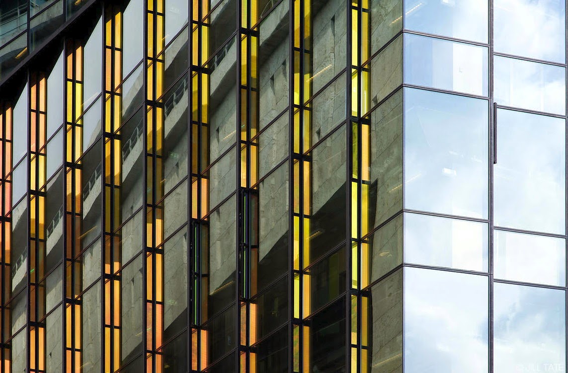
Jill Tate – Architectural Photographer
I discovered
Jill Tate’s work through some investigations and what strikes me about her
architectural work is her use of lighting and colour, how vibrant and
captivating the images are. A lesson to be learnt about my own photography of
buildings is that you do not need to capture the whole building and often they
are more interesting when this is not done.
Her
profile reveals that she brings her own creativity to her assignments and this
is very much evident in her work:
Building Photography Exhibition - London
The
link below details a building photography exhibition on London which would have
been perfect to attend as I research for assignment 3. However it does detail
the images of the winner and runners up.
The
winning image is very interesting and its difficult to identify what it is the
man is in, but its his small size that gives scale to the tunnel:
Buildings
In Use – Assignment Images
Set
1 – Tesco Superstore in Warwick
Tescos
claim to design stores to suit the varied shopping patterns of customers. Often
these stores are designed and built as Express, Metro, Compact and Superstores.
Whilst
I can recall Tesco stores in my teens, now reaching 50 like several other of supermarket
giants, they no have a big presence everywhere and have all but driven out the
small local stores you used to see in villages and likely brought about the
demise of the milkman doing early morning deliveries. I had a Sunday morning
job assisting one when in my early teens.
The
images below were taken at the Tesco Super Store at Canon Park Centre in
Coverntry. All supermarkets are designed with a view to making the shopper
spend money, often more money than they had intended. The link below is in
interesting article detailing 15 ways supermarkets “trick” you into spending
more money:
Interestingly
the first one detailed is the shopping trolley.
Image 1a
The
shopping trolley was a 1938 invention and designed to allow customers to make
large purchases more easily. I think many customers have entered a store
wishing only to purchase a few things, easily carried by hand, then get seduced
by other items and return to the front of the store to get a trolley. For a
superstore such as this large trolleys are required, encouraging customers to
buy more goods. The entrance to this store is within the Canon Park shopping
complex and the trolleys stored outside the store right in front of the Costa
Coffee shop window.
Image 1a - The
focus need to be on the trolleys in the foreground. The background can be blurry, this is a
creative decision but it seems essential that the trolleys in the foreground are
in focus.
Yes, it was a completely creative decision to have mid image focus to draw the eye through the image but as suggested perhaps this does not work. Thanks for the advice
Image 1b

For a superstore this for me is an entrance that seems to small for people to enter and more importantly leave with their goods. The entrance however can cause a funnelling effect. The second in the list of how many supermarkets try to get you spend money is having high margin goods such as bakery and floral items close to the entrance. In this instance the bakery is on the left and the floral items on the right. Straight in front of the entrance is the customer is getting seduced with money offer posters. For these 3 people who were in a group its interesting following each persons head direction as each are seduced by different items within the store. Notice how the cream flooring, ceilings and pillars is evident helping toward a more relaxed atmosphere.
The use of the vignette in this image is an effect to draw the viewer in
to the image but I don’t think it is necessary and I don’t think it works well.
I would avoid the use of effects such as this since it rarely adds to the
meaning of the image.
Ah, OK. My choice was to focus the viewer on the small doorway into what is called a Superstore and I wanted to express this in my image as it appeared to be small for commercial reasons to funnel people and to ensure they take not of the advertising right in front of them as they enter. Perhaps in these type of images I must let the viewer explore this feature. Again its risk taking I am attempting so of course sometimes I will not get this right.
Image 1c
Maximising space, use
and mix of colour, items placed at eye level all make items more desirable to
help influence you that you need them. In most stores there is an army of
workers refilling shelves with items and tidying up after customers. In this
image whilst we see some lemons have escaped into the lime cartons at the top
right I noted a missed opportunity for filling the cartons; the pomegranates
need topping up and the carton next door is empty and so a lost sales opportunity.
I had trouble composing this image to look attractive in the frame due to the angle
of the cartons though I feel I have captured the energy of the colours of the
fruit which at the time for me was an attractive feature. I also note for some reason I've not got the sharpness I expected. Even nature has its
way of seducing people to eat its fruit and so hopefully spreading the fruit
seeds for future growth
Image 1d
Note here the width of the aisles and this is a big concession from the supermarket to give up selling space to allow shoppers more freedom. The article I reference above again highlights these race track aisles. The article says the individuals will tend walk along the left side of the aisle (then back on the left) as they are conditioned to driving on the left. High value items placed at eye level with necessities placed high or low, Also look at how high the items are stacked maximising retail space. In this image I note its one of few locations that disable people get a lot of space but its clear this is focused on the shopping trolley size, higher in the image, and not disabled customers.
Set
1 Summary
The supermarket industry is
big business and most stores are laid out to set plans based around tried and
tested methods for maximising sales. The end of each financial year will be
anticipated by many seeking to understand which store brand has down well and
why. Loyalty cards again give stores further methods to study their selling
techniques and will be store related allowing them to determine how well new store
layouts may increase their revenues.
I mentioned at the start of this set how
the superstores have caused the demise of the local village stores and the
milkman; with all modern day superstores its no longer just food they sell.
Many stores have crossed over into clothes, music, gaming, phones etc. Looking
at modern day high streets its not hard to feel sorry for high street shops who
cannot operate at the same margin level the big stores do, a clear case of a
lot of a little makes more money. These shops are in decline as the big
supermarket chains continue to increase their footprints in our towns and
cities.
In my image I've tried to express the sheer volume of items available and the professional approach to getting shoppers to buy and spend money on products and how it is difficult for the small local family run stores to compete.
Apart from that the images are good and they communicate what they where
intended to.
I can see in hindsight that the last two images are perhaps more commercial however I have attempted to apply my own style which has not quite worked. Perhaps for these types of images it should be more subtle rather than so obvious which may detract from the message I originally intended
Set 2
– Kings Walk Multi-Storey Car Park
There are 15 pay and display car parks in Gloucester, 3
are multi storey. These car parks play a role in supporting the Gloucester City
economy providing parking facilities for shoppers, businesses and tourists.
It was not that long ago that all multi-storey car parks
had a barrier entrance requiring you take a ticket and a barrier at the exit requiring
you to show your ticket to the attendant who calculated the cost and you paid
him cash. I recall the queues getting out whilst people searched for money, I'm sure causing people to over-run and move into the next hour and costing more
money.
Efficiency has improved perhaps with most car parks now
having a pay and display facility. Less queues getting in and less queues
getting out. It seems there are no more ticket attendants but likely a parking
attendant checking valid and displayed tickets. It's possibly a gamble for some
whether they pay or risk a parking ticket when they return.
Image
2a

The modern day method of paying for your parking now
accepts cash and card payments. Its even possible to pay using your phone
conforming location code, car registration and payment details. Efficiency is
key to car parks and of course ensuring they pay offering options other than
cash helps to ensure revenue. Colour coding of buttons reflects the go, stop colours we are used to and with cool colours ensuring their purpose is clear. Machines of old would just have chrome buttons. Whilst the building may not have been updated much since it was built, elements within have been enhanced to help customers.
The use of the wide-angle lens and the close downwards pointing angle of
the camera resulted in the object being completely distorted and the image
doesn’t reveal the true shape of the object.
I was attempting to put more interest into a common object with the use of diagonal lines to avoid the image appearing boring and to emphasise its height. Its an object that needs to be used by people of all sizes and for me at 6ft 1" I wanted to suggest how small it was. I think what I should be doing is still being creative but to take a wider selection of images including in this case a face on image. Then comparing the images perhaps I would have made the better selection
Image 2b
A car
park is used to generate income as well as provide parking space for visitors
to the town centre. I’ve created an unusual angle using some dynamic diagonal
lines created by tilting the camera and climbing slightly above the car. The
image shows the car within parking space and in the background other cars also
parked. Note the alternating colours of the cars blue white etc, the red car
breaking the pattern.The function of the building is very evident in this image.
Just as the previous image, this one is distorted too. The perspective
you chose is similar to the ones used by CCTV cameras and doesn’t reveal the architecture
and the functionality of the structure.
Yes, as per my comment above perhaps I should spend more time experimenting then reconsidering the brief and making the best selection. Again its a creative risk taking approach I have attempted which has not come across as well as I intended
Image 2c

This
image was taken slightly crouching to give a different perspective, low like
that of a driver in a car, or someone hidden behind a car. The white is the safety line within which
pedestrians are deemed safe from cars driving around the car park and in this
image serves as a lead in line to the pedestrian. Using a 20mm lens the field
of view is different and the imposing concrete structure can be seen. The
brighter light can be seen out side, inside a dim and exposed concrete interior.
Many films have used multi-storey type car parks in films to create suspense
when a victim is being pursued by an attacker. With this image I hoped to
capture some element of this.
This image reveals more in that sense. The space is represented better
and the person and the cars show the functionality and the scale of it. Overall
this image is good.
This feedback helps understand how I can continue to express my creativity yet remain connected to the assignment brief. This is the balance that I should be seeking and this helps the previous image feedback give me a better perspective. I mentioned "subtle" above and its this which I should be seeking
Set 2 Summary
Car parks are designed to park cars and need to allow cars to move along potential spaces and up and down floors for drivers to either find spaces or to leave the car park. Efficiencies and savings now result in payment machines instead of car park attendants. However car parks can in certain areas and at certain times of the day appear uninviting and dangerous places to be alone. They are stark and sometimes poorly lit and can cause anxiety to potentially vulnerable people, particularly lone females and the elderly.
I've tried to be a bit creative in my photography with different view points and angles to create images that still reflect the building they are taken in but to also create viewer interest.
Set 3 - Gloucester Cathedral
Gloucester Cathedral originated around 678. Originally built as an abbey church it contains a Norman nucleus and additions of gothic styled architecture. Interestingly it contains a stained glass window detailing the earliest images of golf and a carved image of a ball game thought to be the earliest image of medieval football.
It is 130m long, 44m wide and with a central tower at 69 m high. The nave is massive Norman with an early English roof, the crypt, under the aisles and chapels, is Norman as is the chapter house. The crypt is of the four apsidal cathedral crypts in England.
Both my daughters have performed in the Gloucester Cathedral as part of a choir.
Whilst it is functional as a Cathedral it is also a tourist attraction and whilst free to enter donations contribute toward its up keep. In addition it continues to be used as a set for film locations used in the 1st, 5th and 6th Harry Potter films and also this year for the film Sherlock
Image 3a
In this image I've wanted to avoid my previous mistakes of photographing architecture in avoiding always trying to capture an image of the whole building. In this image I've wanted to capture elements of the external architecture and significantly it being Easter the wooden cross outside, with the flower arrangement,reminding us of the importance of the church as part of religious festivals. This image also shows both the Norman and Gothic architecture styles of the cathedral.
The Camera is pointed upwards and the building seems to be ‘leaning
back’ or ‘falling back’. For architectural photography it is essential that the
camera is held in a horizontal position and that the lines of the object are
not falling down.
For this reason photographers often look for elevated positions to take
photographs of buildings or use Tilt and shift lenses with which you can shift
the lens upwards without changing the perspective.
Alternatively you can shoot form further away and crop the image or use
the ‘Lens Correction Filter’ in Photoshop to straighten the lines.
Yes with hindsight I should have corrected this in Photoshop. Its a common problem in architecture photography. The image below is after I have used the Photoshop lens correction filter to adjust the vertical distortion. In the future I should recognise this as a potential problem, understand what I need to do in post processing and realise I need to allow more space at the top of the image when taken since in correcting the image I've lost the top of the building which makes the image unusable and moves away from what I intended to express e.g. the structure of the towers
Image 3b
Its very difficult to capture the sheer size and magnificence that the Cathedral greets you with as you walk inside. The scale, calm and peacefulness is very overcoming. At popular locations its difficult to predict other visitors walking into the image and it is a location of course to be enjoyed and seen by everyone. This was the best of many images at this location where I had wanted to capture 1 or more people looking at the stained glass windows which gives scale to the size of the room but would have preferred to have not had the gentleman in the red jacket. The chairs on the left indicate that the Cathedral is very much in use as part of formal services.
This image has very good composition and lighting and overall it is striking
apart from the same issues with the falling lines that the previous image had.
Pointing the camera upwards can make sense if you are photographing an
architectural detail but if you are photographing and entire structure it is important
not to distort the perspective.
Also the use of a tripod is highly recommended since, especially when
photographing interiors you will encounter situations where long exposures are
necessary.
Whilst I wont correct this since I understand what changes I should have done I will the top of the window whilst correcting it, however I understand fully what is being said. In hindsight I should have recognised the problem and revisited with a tripod and probably taken bracketed images and combined them as a HDR image capturing better the dynamic range of scene my eyes saw but my sensor was unable to capture
Image 3c
I've applied a vignette to this image to focus the viewer on the lady in prayer and to align the image with assignment brief that it is a building in use, worship and prayer being two of the key reasons for most people to go to church, or Cathedral in this case
Apart form the vignette, this image is very good.
As mentioned earlier I have allowed my creativity to exceed the boundaries of subtle. I've used a vignette to help focus the viewers eye but interestingly in some of the P & P exercises I've performed after this assignment I can see the value in allowing the viewers eye to do the searching or at least be led very slightly. This can make an image more powerful and also rewarding for the viewer to find the figure
Image 3d
Its very difficult to capture the sheer size and magnificence that the Cathedral greets you with as you walk inside. The scale, calm and peacefulness is very over coming. In this image I've captured the height of the ceiling and the large pillars which are given a sense of scale by the chairs in the rows. I've waited to be able to obtain an image with no "tourists"which I felt added some purity to the over all feel.
This image is also very good apart from the same issues that applied to
the images 3a and 3b.
Thanks. A good lesson learnt here when photographing buildings, interior and exterior, to be aware of how using a wide angle lens can make the building appear to lean back. I've corrected this below and the correction makes the image much stronger as a result
Set 3 Summary
In this set of images I've purposely tried to express both sheer size of this beautiful cathedral but also its purposes and to express a feeling as to why people feel so comfortable, inspired and at ease in such a location.
Set 4 - H & M store Gloucester
Like all shops the idea is to attract shoppers in and to encourage them to spend money, and often to entice them to buy more than what they had originally intended. All shops are space restricted and key decisions made on layout, racks of clothing and models to display combinations of clothes. This set of images focuses on the mannequins within a store
These images are slightly underexposed and edited a bit dark. This is a
perfect example for images where a tripod and longer exposures are necessary.
Though I'm not sure if I could have used a tripod within the store I could possibly have bracketed and combined the images as a HDR or used a single image and created an under and over exposed versions and combined all 3
Image 4a
Its often the clothes in combination on the mannequins that help shoppers to see the clothes more fully and I wonder if they ever look at their reflections in the mirror to see how well their clothes fit and suit them.
4a – The composition is slightly awkward and doesn’t reveal as much as
the images 4b and 4c.
I think my creative juices have over run and in this image I've attempted to suggest that the mannequins are "checking themselves out" in the mirror. Again with hindsight I should have taken more images as as learnt in the DPP course then later made the best selection. Having more options in digital photography is very easy and I should take more advantage of this
Image 4b
A continuing theme here with the mannequins as the subjects in this set of images. Their position this time more prominent in the store. I've composed this image to also contain the picture on the left and the camera height allows the view to see the gaze of the subject in the picture admiring the clothes on the mannequins.
4b – Is underexposed and edited dark. Additional lighting would be
necessary to light up the mannequins.
Yes, thanks. In hindsight I think this image should have been the one I submitted
Image 4c
The mannequins in this image are "basics" as the sign in the top right of the image suggests; this pair are just half bodied compared to those in the previous 2 images and are basic in comparison.
Image 4c is the strongest in this set since the mannequins are lit very
well and stand out of their background. Also the composition and the exposure
is very good since the background is much darker than the mannequins.
Set 4 Summary
This was an interesting challenge by taking images in a store with both shop assistants and customers around though the images totally isolate the mannequins from real people to make the shop appear empty.
Anybody who has watched the films Omega Man with Charlton Heston and its modernised version Legend with Will Smith may recall the part the mannequins play and in this case the desire that the lead actor has for them to be real people due to their current loneliness.
Here in these shops their prime purpose is to display clothes in a "being worn" style as opposed to the majority of clothing in rails on hangers.
Fashion shops continue to display their clothing both in line with trending fashions but also to freshen up a shop with new ideas for regular shoppers to promote their interest with the prime purpose of resulting in sales.
Set 5 - Eastgate Shopping Centre, Gloucester
For this set of images I've focused on some of the mechanisms to allow shoppers to reach and leave their destinations. These are key methods for transporting people but the level of care given to their upkeep can vary yet have a significant part to play in the shoppers' overall shopping experience.
This set is by far the strongest in this assignment.
Interestingly I was able to spend a lot more time examining the scene and taking the images in this set and took many more images and was able to have a better selection from which to make a choice
Image 5a
The grotty, dim and dingy stairwells that many shoppers are required to use when moving between car parking and shops would put most people off. When filled with undesirables it can be a frightening experience for lone individuals. The colour though limited with the red hand rails and faded blue paint did at one time deserve some considered thought.
The composition of this image
is very well balanced and the red rails stand out in this image. You chose a
very good angle, the exposure is also very good and the lines are straight. This
image requires a tripod as well in order to have the entire image focused.
Apart from that this image is excellent.
I think in the absence of a tripod I should have increased the ISO to give myself a faster shutter speed and perhaps a smaller aperture would have enabled better better and sharper focus throughout the whole image, particularly the window frames. I need to trust my initial composition more and then spend more time reflecting on the technicalities of the image. This has been a change in my work and clearly its the balance I need to find now having moved from one side to another
Image 5b
This air bridge allowed shoppers to cross from one building to another. I actually visited this location on 2 separate days and identified the timing of when the shadow would be roughly central in the walkway and also when the bright sun was out. This was a good lesson learnt as part of the early exercise space and light. The image is very much better than the one I produced on an earlier visit. The sunlight, light reflections and shadows really bringing this image to life making it much more interesting
This image is also excellent. The light, the reflections and the shadows
really bring this image to life. Also the colors are very vibrant and the
choice to have people in this image was very good since you showed the
functionality of the space as well as the scale by doing so.
Yes, this stood out to me and at this point I'm now beginning to get more confident in my street photography with people and smiles make it all possible. In hindsight review this again more critically I should have considered making the red rails bolder this final image is really exactly what I saw and the wide angle lens allowed its capture as my eyes saw it
Image 5c
In store movement between floors is much more attractive both in terms of the type of transport and the approach to the design of wall space. I've waited for a single person to use the escalator so that a sense of direction for both can be determined. My timing was slightly off as I had wanted to position the individual slightly to the right within the black "X" of the escalators hand rails.
This shot took some obtaining to get the image that I wanted and to ensure that people weren't distracted by me with my camera. Many people were and reassuring smiles were given to staff and customers who did seem at ease with what I was doing. In this case the lady on the escalator is a member of staff as determined by her red lanyard around her neck and I think already used to my presence. I thank everyone for their trust in what I was doing and I think an element of presence that looked like I should be there did not arouse suspicion from anyone.
This image is possibly the strongest of all of them. The angle in which
you shot it form is very good and cross of the escalator creates a very dynamic
composition.
The person is slightly off center, which in my opinion is perfectly placed
since it gives the image additional dynamics as opposed to when the person is
in the dead center.
Remarkably the color of the woman’s hair, scarf and clothes reflect the
exact colors of the graphics on the wall. Even the grey colour of the escalator
is replicated in the graphic. Overall this image is outstanding.
This final set is the strongest and you should set yourself as a
standard to produce images of this quality for your next project.
Thank you and given my previous critique of my images in reflection reading your feedback this particular scene I took 12 images balancing the need to getting the image I wanted against looking to obvious and causing a problem in the store. This really brings it home to me the requirement to take multiple images reflecting, adjusting varying approach of out creative through to simple reportage to give me more choice for final selection; its matter of patience and preparation as you have suggested at the start of your feedback.
I'm please that I am able to reach fairly high standards with my work but of course consistency is important and I should reflect more on what I have and be more critical of how I can improve
Set 5 - Summary
These 3 images are listed in my view of the most attractive methods that people can use to move around the shopping centre. Space and light being very key elements, especially when combined with colour and design.Whilst good intentions in design are made when buildings are first built, it needs to be constantly assessed to improve the experience of visitors to shopping centres. This is often a key reason why many shoppers travel greater distances to newer and modern locations; and without income derived from business those left behind deteriorate very quickly and become undesirable places to visit.
Key Learning
a) a presence and smiley face can greatly assist when performing street photographer. Being discreet is always one option, as is look as if you should be there another. This can increase the chances of getting the images you want and also for potentially capturing images with decisive moments
b) Space and light are very key to creating an image and be used to influence the feel of an image, this is apparent in the contrast between images 5a and 5b above.
c) Camera position, height and angle as ever can be used creatively to create an effect matching the photographer's vision. Its something also expressed very well by film directors when creating a specific feeling within a film scene
d) This knowledge and growing confidence using a camera in urban surroundings I think has started to i,prove my photography, if even at the least I can focus on creating the image and being less concerned at people watching me; a careful balance sometimes
e) Building architecture can, but doesn't need to
be contained in its whole within the confines of the camera frame.
Learning Logs
or Blogs/Critical essays
You have been sharing your thoughts on your work but also on your
research so your blog is on track right now and doesn’t need any specific
improvement.
I'm pleased you have noted this because I have taken steps to improve my blog as well as document my research and give my own personal view that I have when reviewing work or articles. This is starting to have an influence on the work I produce and how I capture it
Suggested
reading/viewing
Look at the work of:
Fabrice Fouillet (Church Interiors)
Rut Blees Luxemburg
Thomas Struth – ‘Museum’ series
Melanie Manchot – ‘Groups and Locations’
Marco Bohr
Helen Binet
Iwan Baan
You have been reading some theoretical books, which is good. I
will write several recommendations down to further your research. Have a look
and choose one that seems relevant to your practice.
David Bate’s Photography (Key Concepts)
http://www.amazon.co.uk/Photography-Key-Concepts-David-
Bate/dp/1845206673/ref=sr_1_1?s=books&ie=UTF8&qid=1414431296&sr=1-
1&keywords=david+bate
Stephen Bull Photography (Routledge Introductions to Media and
Communications)
They both cover similar topics so there is
no need to read them both straight away.
Other suggestions for reading would be:
John
Szarkowski, (2007) The Photographers Eye
Liz Wells, (2002) The photography Reader, London
Routledge
Pointers for the next assignment
Try to apply
the feedback to your work and improve your work technically. Try the courses www.lynda.com
for some more detailed technical workshops. They have online workshops on every
possible subject and I can really recommend them since I have used them myself
a few times.
Look at how
the mentioned photographers composed their images and how they used people in
their work.
Carefully
choose the places that you want to photograph and take your time with your next
assignment. You have proved that you can make very good images and that should
be the level that you should be aiming for.
Good luck!
Thank you very much for your feedback as this not only helps me set my own quality bar but also helps me rebalance my approach to my work. There has been some really accurate and helpful feedback and possibly I feel this has been key in helping me push on creatively but also to remember key foundations to making good images