The purpose of this exercise is to take 20 photographs of subjects where each is taken both in a horizontal and vertical format. There is a natural trait to take images in a horizontal format as the view matches more what our eyes would naturally see, in addition there is I'm told (Michael Freeman) to place the weight of the subject in the lower part of the frame as opposed to the centre. Some subjects will best suit vertical frames rather than horizontal frames.
What I've not done is to take all 20 images first in horizontal format and then return later to take again in vertical format; this didn't seem practical given the number of images and it appears that most students, per their learning logs, perhaps have thought the same. I hope this doesn't detract from this exercise.
The majority of these images were taken on a car tour one afternoon stopping at various locations going through Lydbrook. Eastbach and Lower Lydbrook. I had no preset ideas what images I wanted before leaving and just stopped when I saw something of interest. I hope I have captured a variety of image types.
Image Pair 1


In these images the weight of the subject I feel is central, the vehicle tracks not quite as prominent as I thought they would be to add more interest to the image. The horizontal image is more appealing I feel but would further benefit with a crop to the bottom to remove some of the field.
Image Pair 2


Image Pair 3


This pair of images were taken using a flash and whilst the subject may not appear particularly interesting the contrast between the yellow marker and the green foliage initially appealed. In both images I've tried to place the yellow marker on a zing point; for me the vertical format works better giving some background interest (even if minor) with trees.
Image Pair 4

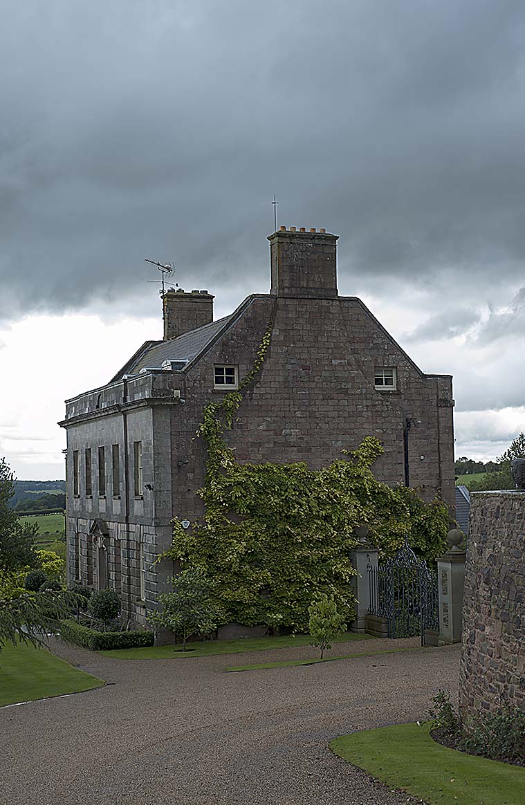
I think the images for this subject work in both formats but I feel the vertical image is better as it contains a drive which allows the viewers eyes to flow into the image and toward the house, much as you would if driving or walking to the house.
Image Pair 5


Image Pair 6


A bit of a disaster in terms of subject and composition I think but as its an exercise I've included it. In hindsight I should have chosen the subject as the left hand flower and focused on that using the wide aperture. This would also have been better suited to a vertical format of the image. Additionally the over exposed sky adds nothing to the image so would normally be cropped or as mentioned above, better composed. Always looking for ways to learn from mistakes!
Image Pair 7


I was drawn to the postbox by the contrast of red and grey. Both images were taken placing the letter box on the right hand vertical third of the image. At the time I took this pair of images I felt the horizontal image would work best when out of the camera I feel the horizontal image works better.
Image Pair 8


The blue of the sky and the tractor's attachment attracted me though I think in hindsight I should have crossed the fence and got closer to the tractor. No great images but I think the horizontal image is better as it removes much of the uninteresting soil. Poor composition by me in these pair of images I think.
Image Pair 9


I've selected this image for its obvious vertical element. If I had more control of the situation I think I would have used a smaller aperture and brought the window into focus if it had someone inside so the the top of the post could lead the eye to the window. I didn't want to look like a stalker! Looking at the image now it clearly works better in the vertical format and also with the post better place on the left hand vertical third.
Image Pair 10


This scene appealed to me as it looked like the grass bales would roll down the hill. I think this is better emphasised in horizontal format plus has the building as additional interest within the image which helps confirm the camera was level and not tilted to cause the look of a slope.
Image Pair 11


Image Pair 12


Image Pair 13


In hindsight not a good image to use as it likes a main subject subject and with a zoom lens the first image of this pair could be considered for a "many" in the Contrast assignment. Too much wasted space with the grass in the vertical image (and also the horizontal image to be honest) so as with most landscapes horizontal format often works best
Image Pair 14


The focus of these images is the 3 contrast elements of wheat, grass and stormy sky both in texture and in colour, for me this works best in horizontal format, I do clearly need some more images more focused on the vertical
Image Pair 15


The vertical image gives more of a natural flow to the image so that the eye more naturally follows the curve of the road through the image
Image Pair 16


A clear case of what is seen by the eye is not always captured by the sensor. I've gone for the colour contrasts of thirds of road, buildings and sky with colour between the 2 greys. The red and white umbrella's have not been as significant as they seemed in person; horizontal format works best here
Image Pair 17


I think both images could have worked though I've cut-off the top left bend of the river in the vertical image. In both images the sky is over exposed though I have managed to get the canoes on a zing point. The key aspect to both images which works is the river flowing from the right to bottom left to take the viewer through the image I think. Nice idea but poorly executed
Image Pair 18


An image at contrasts (attempted) between water, foliage and sky. I think this works better in vertical and the sunlight on the trees top third is more visibleImage Pair 19


A clear subject for a vertical framed image which doesn't work in horizontal format. In the horizontal image I would have had to walk further back to incorporate the whole telephone box which would then have been smaller as a result in this composition.
Image Pair 20


I took these images, as I did the others, using a 50mm. I think you can see from these images as I've tried to include elements of the subject of tilted the plane of the sensor which can give a building a leaning back feel. Out of these 2 images the vertical image works best but I think I should have stood back further as it feels looking at the image that I've cut too much of the church out at the sides.
Exercise Learning's
a) There is a natural tendency to take images in the horizontal format as this is more like what we are used to seeing with our human "binocular" type of vision with eyes side by side. However sometimes photography is also about taking images in a format that we are not used to seeing either because it doesn't fit in the frame or perhaps we want to do this create an effect or feel to the image. Image Pair 10 show how using a horizontal frame an effect of the bale rolls perhaps getting ready to roll down the slop can be emphasised to the image viewer.
b) Most camera's(pro camera's aside) have the shutter on the top if the camera making taking horizontal images easier but not so when taking them in a vertical frame. Taking more image in a vertical format would help me to get more used to pressing the shutter release button and better develop a comfortable way of holding the camera in this way
c) Some subjects / views will appear to suit either vertical or horizontal framing but it is worth also considering the opposite sometimes as this can have a different effect in the image or perhaps focus the viewer onto something perhaps they would not at first consider
d) Landscapes often appear better in a horizontal frame but in the case of Image Pair 14 the effect of colours and textures in thirds in the vertical format it can be equally appealing and perhaps more emphasised in this case.
e) I am again reminded tot to rush my image taking and to take care to explore a potential image considering both major composition elements as basic as a horizontal or vertical frame or simple changes such as a few steps closer or further back. The key here is also take images of all variations (being a digital camera and not a film camera) and as I learn the art of photography allow myself the freedom to explore this and then review the images when back home; not only to see which works best in this case but also to learn what could work at another time or location
f) I have at times focused on one element of the image I'm capturing but at the expense of something else. Image Pairs 5 and 6 show where I've forgotten why a centrally place subject in the image doesn't sometimes work well and subject focus should be better considered and explored.
g) When I compose an image I should look carefully to help identify elements which could detract from the final image. Image Pair 12 have both a stinging nettle and fly filled spider's web which with a little care could have been removed and so not captured in the images
No comments:
Post a Comment