TAOP Part 3 Colour
Exercise 2 - Primary and Secondary Colours
This exercise is about finding a scene where each is dominated by one of the primary colours or the secondary colours.The primary colours are red, yellow and blue. The secondary colours are termed, per the course notes as green, violet and orange.
The secondary colours can be created by mixing two of the primary colours, and tertiary colours can be created by mixing adjacent primary and secondary colours.
The following images contain a scene dominated by one of the primary or secondary colours. In taking these images I've used bracketing to under and over exposure by 2/3 stop (+0.7 or - 0.7) from the initial camera metered setting as this is a quicker process than working in manual mode as per exercise 1 and so easier to create the same frame when the camera is hand held. Again all images are unprocessed jpgs out of the camera
Image Set 1 - Red
I've tried in this image to use a macro lens and focus on a red peppers seeds understanding the small depth of field of the macro lens wide open will blur the red of the pepper to help focus the viewer on the colour and not the pepper. With hindsight the DOF is to small and I should have attempted a small focus stack set of images. Alas the pepper has been eaten but I like the natural colour of the red pepper so have continued to use the image.
This image normal exposed appears the closer to the Colour wheel primary Red
This image is under exposed by 2/3 of and is a close match
This image is over exposed by 2/3 of and is also close in colour to the primary red
Image Set 2 - Yellow
This a lemon taken against a background of my gym shorts in natural light. Out of the 3 images I've chosen the camera auto metered image as that closing matching the yellow in the colour wheel however I feel the metering may have slightly been fooled by the dark background and perhaps has very slightly over exposed.
This is the 2/3 stop under exposed image
This is the 2/3 stop over exposed image
Image Set 3 - Blue
I've been struggling to find something blue that might be a different and avoids the blue house front door so I tried a picture of my trainer with a small DOF focused in the middle of the trainer to add depth to the image and I have given the camera a cheeky and jaunty tilt to help it have an advertising type of look. Looking at the trainer sole (the different shades of blue contrast well) I've taken the image 2/3 stop under exposed. The under exposure bring the trainer's sole a bit darker and close match of the primary blue colour
This image is over exposed by 2/3 of a stop
This image is normally exposed, per the camera
Image Set 4 - Green
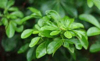
This image is taken outside and in the rain of bush that has retained its leaves during winter. I've felt that this under exposed image (-2/3 of a stop) of the shrub's leaves matches best the secondary colour green in the colour wheel.Variations in the colour green are evident here both due to the light and the older and new leaves of the plant. I expect also some raindrops on the leaves will also reflect light adding to the variations
This is the camera metered and exposed image, which is a bit too light
This image is over exposed by 2/3 of a stop and is also too light
Image Set 5 - Violet
This image is of an Orchid and the colour best matched the violet of the colour wheel above using the under exposed image, though the back lighting of the orchid's petals does cause some colour variation for each petal.
This is the camera metered "correct" exposure
This is 2/3 stop over exposed image
Image Set 6 - Orange
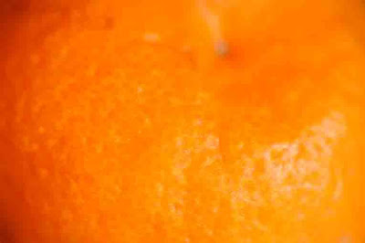
I found this a difficult colour to match to its secondary colour on the colour wheel. Constructing this image I had the brainwave of using a satsuma on top of bottle and used a macro lens to make an almost abstract image but I think there is enough there for viewers to see that it's a fruit. As you can see in this image, and here using a spherical object, the light falling on the subject can vary its colour. This image is the camera metered exposure over exposed by 2/3 of stop.
Having this colour fill the frame for these 3 images looking at them on a cold day makes me feel surprisingly warm
This is the 2/3 stop under exposed image
This is the camera metered normal exposed image
Exercise Learnings
a) I hadn't really considered that under or over exposure can alter a colour's strength and this exercise really does enforce this
b) Scrolling quickly through this blog quickly and seeing the primary and secondary colours does strangely give me an indescribable lift in terms of the colours and change moving from one to the other. What a dull world it would be if all colours were dull and muted
c) Nature's colours clearly have a purpose of attraction and interestingly this also works in infra-red at certain wavelengths, based on the visible wavelengths that insects / animals see things
d) I have not specifically thought of colours when taking photographs but its clear even from this exercise how colour can give impact to simple images where to a degree the object becomes less important and the colour of more importance


No comments:
Post a Comment