Tuesday, 23 October 2012

TAOP Part 2 - Exercise 6 Implied Lines (Using Lines in Composition)

TAOP Part 2 - Exercise 6 Implied Lines (Using Lines in Composition)

Initially for this excercise I've been asked to look at two images and to show on each:

a) implied lines
b) if line direction a long line is dominant, show so with an arrow

Image 1
An image by Michael Freeman


In the second I have shown an implied line at the top from the bull fighter as looks at the bull to judge its speed, turning circle and his space. The arrow at bottom left shows the implied line of itys travel then the second above the bull's head as it turns to face the red cloth.

Note how this shows the red side of the flag to the bull in the right hand but yellow in his left hand. Its clear which the bull fighter wants the bull to focus on, given we know bulls' seem to follow red.

The curved line from the flag in his right hand is a dominent but implied line that if the action should be unfrozen, the bull fighter would pivot on hos feet and twirl the flag along the line of the arrow for the bull to chase.

These elements allow action and movement to be implied in the time frozen image


Image 2
Gotthard Schuh's image,  "Threshing Corn in Sicily"


The is a strong implied line of movement from the farmer and his legs indicate he is running toward the harnessed horses and the direction of his set very obvious and also exampled by a red arrow.

The line of sight of the horses is also exampled as an inplied line with the red arrow at the top.

The farmer is controlling the direct of the horses and the line of movement of the horses bodies, also in relation to the direction their heads are following imply a change of direction along a curved line, this indicated by the bottom most arrow.

Again, this is an excellent example how lines, strait, acute or curved give energy to an image even though the activity photographed is captured as a still.

The next 3 images are my own taken in the past exampling implied lines

Image 3


This is a bridge at Lydney harbour. There is an implied line that the viewers eye will follow across and back over the water. I find that the eye likes to travel over water and like people is assisted by bridges.

In this image the bridge pathway is curved and makes thi smore interesting for the eye to follow takeing the view across the full width of the image

Image 4


This is an infra red image taken at Go-Ape in the Forest of Dean


There are two implied lines here in this image:

a) the line of sight from the boy as he travels down the zip wire

b) the movement of the boy as he moves along the zip wire from right to left across the image


Image 5


This image was taken at Eastbach and the subject appears to be contemplating life as she gazes up the hill. This line of sight is an implied line and encoiurages the viewer to follow her line of sight and wonder perhaps at what she is looking at.


Exercise Learnings'

a) Implied lines can be used by the photographer to direct the viewer to an element within the image. This can be another specific item or even a direction of movement. Both elements can create dynamic movement within the image and so strengthen it

b) Action images captured static can still retain a sense of movement

c) The implied line created by the photographer can be both strong or very slightly leading (and somewhere in between) to encourage the viewer to discover other elements within an image

d) Eye lins can be very obvious in directing the viewer through an image by the placement of the head and the direction of the eyes

e) Michael Freeman's image of the painting of the Virgin looking toward the cardinal on the stage can create a very dramtic effect. In this instance the angle of view to create this line of sight has been found by the photographer to help dramatise the image, rather than perhaps it being right in front of him, this image I've inserted below as an example of an implied line of sight captured / created to cause an dramatic impact. I've not drawn the line so that the viewer can discover this themself:




Sunday, 7 October 2012

TAOP Part 2 - Exercise 5 Curves (Lines)

TAOP Part 2 - Exercise 5 Curves (Lines)

For this exercise I'm creating 4 images of curves.

Image 1


I've centrally placed the mini roundabout in the frame to allow the curved brick edging to dominate the image. The directional arrow signs on the roundabout help to create movement and flow a round the roundabout. In addition to the roundabout itself the are additional curves to found in the road signs.


Image 2


This image was taken through a shop window. The concentric circles in the layers of the cake are shown from this position as a series of curves climbing higher with each layer of the cake.The curves are further emphasised with the ribbon around each layer. I liked the potential of the image especially with the 3 cakes at the front which contrast with the larger cake and give a sense of size. Had the shop have been open I may have gone in and discreetly moved the distracting items top left of image.


Image 3

 
The unopened petals of a lily display the subtle and gentle curves and encourage the eyes to move around its shape which contrasts against the background. I've also used the diagonal lean of the flower to create the diagonal line and further add a dynamic element to the whole of the image.


Image 4
 
 
A little more obvious than the first three images here with the curves of the clocks outer casing, glass and dial and the curves on the majority of numbers of the clock's face. When cropping this image I've not cropped to leave the clock central as I may have done but off set this from the centre. I've used the right hand edge of the cupboard's diagonal line as a lead in line toward the clock...well I cheated a bit and moved the clock to the side to use this.
 
 
Exercise Learning's
 
a) I found curves harder to find than lines I used in previous exercises. I think this was because I was looking for actual lines where perhaps I should have considered implied curves
 
b) I could have and should experimented with my 20mm UWA lens as this can create curves from straight lines for very interesting effects
 
c) I think with more imagination I could have waited for curves to appear, perhaps in people or moving objects rather than looking for curves in static objects
 
d) Curves in images appear to give a graceful sense of movement within a static image and depending on how they are used, just like horizontal, vertical and diagonal they can be used to draw the viewer's eye through an image


Sunday, 30 September 2012

TAOP Part 2 - Exercise 4 Diagonals

TAOP Part 2 - Exercise 4 Diagonals

The exercise requires me to take 4 photographs where diagonals feature strongly

Image 1


An old railway goods carriage in an unusual location in the middle of a village with office buildings around it. This carriage has many diagonal steel bracings including the white painted W which itself is made of 4 diagonal strokes. In addition I've made the shape of the carriage appear to diagonal lines by my camera position using converging lines caused by perspective of the left side of the carriage being further away from the camera than the right side.


Image 2


Here I've used perspective and depth to creating the diagonals of the pathway in a small deserted shopping mall. The closed shutters and the wooden roof covering the path all have diagonals in this image. The eye naturally follows the path direction creating a feeling of movement within the image.


Image 3


The left to right upward gradient of the path and the handrails create strong diagonals in this image and again the position and angle of the camera creates converging diagonal lines in the path itself. The path and rails act as a visual pathway that takes the eyes across the image left to right and right to left creating a sense of movement.


Image 4


I've revisited a location I used previously for vertical lines though this time the hay bales are now removed. A different position this time for the camera creates strong multiple diagonal lines in parallel together with the diagonals of the hedges enclosing the light coloured field.


Exercise Learnings'

a) Diagonal lines create a sense of movement and direction within in an image. The angle of the diagonal lines compared to the horizontal line of the top/bottom of the frame will determine the amount of energy implied within the image

b) Diagonal lines can appear naturally as in image 1, can be created through the change in gradient of terrain, by the position of the viewer to the scene as in images 3 and 4 and also by the angle of the camera to the scene, particularly in image 3 where this has created converging lines in the pathway.

c) Converging diagonal lines can be easily be created with paths, roadways etc the travel from the viewers position toward the horizon, image 2 is a good example of this. The eye naturally travels along this "pathway" and through the image; this can create a sense of movement.

d) Parallel lines reinforce the diagonal movement created in Image 4 and though these lines will not converge the diagonal movement is re-inforced with the parallel lines.

e) Often we see horizontal and vertical lines as being obvious and in our everyday lives e.g. tables, table legs, chairs, building structures etc. Diagonal lines are not so frequently seen but exist either naturally or can be created simply by a change of position or camera angle

f) When I first considered how I would approach this exercise I started thinking about where I would see diagonal lines and came out short of ideas. Instead for the first 3 images I simply took a walk around a local town and once I stopped looking hard to find them I found they came to me in such an easy way. I guess they were there all along but for a while I was looking but not seeing. This is something I've began to learn how to do so far following the exercises within this course. When we "take in" a scene or a view we may comment that we like it, it perhaps it invokes a specific feeling but don't understand why. Understanding how lines work within in image helps me now understand how these elements work within an image, a view or scene to create this.

Monday, 17 September 2012

Consistent Processing of Images - Monitor Settings

Consistent Processing of Images

When I started TAOP I did notice what appeared to be some slight inconsistencies between images that I processed

I thought this could be down to the calibration of my monitor for which I had used some simple on-line and free methods for basic calibration.

In addition, depending where your monitor sits and the natural light and artificial light levels and their variation throughout the day it is possible if processing say the same image in the morning, afternoon and evening even with a calibrated monitor it could result in differing results as the lighting you are viewing the monitor in could change.

So my requirements were:

a) to calibrate my monitor (and recalibrate on a regular basis)
b) to have some way of adjusting the monitors display in relation to the changing light levels I'm working in.

Well I short listed a number of options through on-line research and settled on ColorMunki Display. Whilst not cheap it now allows me to:

a) calibrate my monitor then prompt for a regular calibration. I've set mine to once a week
b) adjust the monitor display in relation to the light levels in which I'm working. I've set mine to one every 30 minutes

Having set this up I note the initial calibration resulted in a slightly darker screen and perhaps slightly warmer colours from what I had it initially set to. The result of this is that when processing images I can ensure I have a consistent image produced and one that adjusts to changing lighting conditions. This I am now pleased with.

The weekly calibration takes 6 minutes and the regular adjustment for lighting occurs without you being impacted

My next test will be to send of some images for printing and then compare the prints to what I have on my screen. At the moment though the colours displayed on my monitor using a printers jpg do now seem to also match the test card they sent me.

For people working on multiple processing machines e.g. say 2 different PC monitors or 1 PC and 1 Laptop they need to be aware that a single image displayed on both could be different thus processing required to achieve what appears right on both could show as being different processed on different machines but both viewed on one and no doubt if printed.

I'm hoping that this now ensures consistent processing of my images on my PC / Monitor. Its not a cheap option but doing this helps ensure my final product leans more toward perfect rather than away from it

Ultimately each individual may value different elements from the available calibration tools this product met my requirements. In either case performing some kind of monitor calibration at a regular frequency should be seen as a good activity to participate in.

Sunday, 16 September 2012

TAOP Part 2 - Exercise 3 Horizontal and Vertical Lines (Lines)

TAOP Part 2 - Exercise 3 Horizontal and Vertical Lines (Lines)

This exercise requires me to produce 8 images in total; four with examples of vertical lines and four with examples of horizontal lines. I'm going to convert this set of images to mono so that the colour doesn't distract from the lines within the image. For both vertical and horizontal lines I've tried to include both obvious and subtle examples.

Image 1


This is a picture of a panelled fence where the vertical slats are showing vertical lines. I've used a wide aperture to give a small depth field giving focus to the centre of the image. There is an optical illusion here in that the slats to the right narrow as they move away from the lens and this causes the right side of the image to appear longer than the left side.


Image 2


This is an image of a chair back positioned in a doorway with light coming through the window. Whilst both Image 1 and Image 2 very clearly have verticals lines the photograph taken in portrait format accentuates the vertical lines more


Image 3


A less obvious example than the first two images but the tractor tracks at the bottom of the image, the dominant hedge to the left extending to the horizon and the large log on the right all demonstrate vertical lines


Image 4


Keeping the stone wall on the left of the image gives a clear vertical but the stone step pathway is a more subtle vertical line and acts as a visual pathway through the image as they eye starts at the bottom and them travels upwards.


Image 5


Very obvious horizontal lines of barb wire which strongly contrast against the lighter sky. I've used a wide aperture here so that the clouds / sky are out of focus ensuring the viewer takes notice first of the horizontal lines.


Image 6


The horizontal line of the horizon and also the hedge are the dominant elements of the image and together split the image into equal horizontal thirds of sky, fields and hedge.


Image 7


I've placed the horizontal bars of the gate on a bottom horizontal third and again using a wider aperture and narrow depth of field the horizontal wooden bars being in focus will ensure that viewer notices these first and therefore also the horizontal line I've created.


Image 8


In this image the gate is framed by the hedge to each side and the viewer is almost stopped initially from progressing further through the image because of the gate. With the horizon placed just above the top horizontal bar of the gate, the viewer focuses I feel on the horizontal lines of the bars. A much more subtle example of horizontal lines


Exercise Learnings'

a) Vertical and horizontal lines can be accentuated by using framing composition of portrait or wide respectively.

b) Use of depth of field and focus can assist the photographer in ensuring the key focal point when composing the frame is also that first seen by the viewer

c) Horizontal lines appear to give a feeling of stability; I think this partly due to our side by side eyes seeing things in a wide view and also a self balancing say if you had fallen over to position the horizon in a horizontal line

d) Vertical lines can give an impression of movement, I think perhaps due to gravity but also stability in tall subjects such as trees and buildings. However there remains gravity's desire for such vertical items to eventual succumb to a horizontal format hence I feel the stored energy in vertical lines before being made horizontal; a human standing up right spends energy before resting in a horizontal way.

e) As per my images above vertical and horizontal lines can be seen around us in both obvious and also subtle ways

f) lines can be used by the photographer to lead viewers of their image through the image and so using visual language. I see this aspect more and more now as I follow these exercises.

g) Michel Freeman in his book The Photographer's Eye details how a telephoto lens can help compress an image which can create horizontal lines in landscapes but also by foreshortening a view into a vertical perspective. I've not experimented with this in these images but its something to remember

Saturday, 15 September 2012

TAOP Part 2 - Exercise 2 Multiple Points (Points)

TAOP Part 2 - Exercise 2 Multiple Points (Points)

In this exercise I am required to create a still life using between 6-10 objects adding one or two at a time and each time take a photograph with an aim to create a final grouping that gels together and hopefully is not boring.

I've taken this set of images in the kitchen where I know I will have good options of colour and shape to use.

Image 1


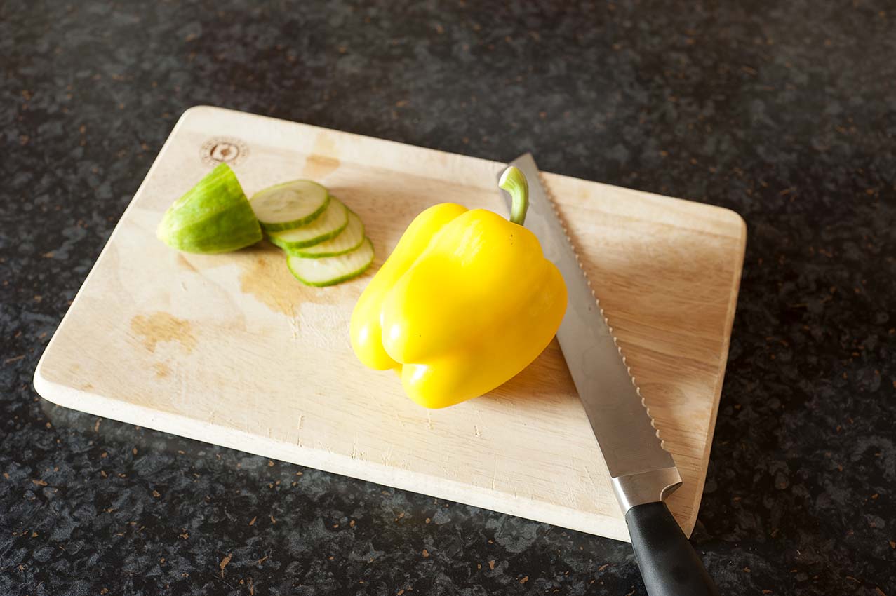
So for the first image I've placed the chopping board at angle, one that you wouldn't normally work at to create some diagonal line to give some energy to the image and I've placed the end of a cucumber on a zing point again to help give the image am implied feel of dynamic movement.


Image 2

 
Next I've added some sliced cucumber and a knife. I've positioned the cucumber so it looks like its just been cut, which it has and also the knife used to create the slices again place at an angle to avoid straight lines.


Image 3


I've now added a pepper. I note here that the camera's auto focus has struggled since adding this likely as a result of the contrast in kitchen work top and pepper plus the natural light falling on the pepper. I think had I set the focus to multiple points rather than central or manual focus I could have overcome this. I've not reshot this as I want to leave this as a good learning reminder


Image 4


I've now moved to manual focus. I've added a red pepper which with the sliced cucumber and yellow paper make an implied diagonal line.


Image 5


I've now added a green pepper which gives a nice colour contrast within the image and is placed to create an implied triangle between the peppers.


Image 6

 
In the final image I've removed the cucumber and and one of the slices and spread these out. I've also added a sliced pork pie which I've showed the exposed inside and placed this next to the knife. I've also changed the placing of the peppers and cropped the image slightly so the chopping board fills the image more.


Image 7


In this image I've displayed lines and implied triangles and circles demonstrating the larger number of shapes within this image and its surprising how many there are. This final image demonstrates what it it is in images that help create interest, its implied shapes.


Exercise Leanings

a) Multiple points can help create implied shapes within an image which the eye can explore and identify. This helps create additional interest and some dynamic movement or energy.

b) In this set of images the initial placement of the chopping board was deliberate to break up a rectangle within rectangle type of image which could appear static. Where the photographer is unable to move objects to create this similar dynamic effect for other items such as people, buildings etc tilting the camera can create this same effect.

c) I need to continuously review my images and their sharpness and always consider what other focus options I have. Image 3 displays a contrast issue which has thrown the camera's ability to auto focus correctly. Switching to multiple or alternative focus points from the central single point I normally use, or switching to manual focus allows the created image to become sharp

d) Making simple or made changes when framing or creating an image dramatic effect can be created changing a dull image into an energetic one

e) I further encounter the power of visual language within an image. Had I sliced the peppers and added some more subjects a story of creating lunch or an evening meal could have been captured in the image

I've really enjoyed this exercise and what could be considered a simple and quick exercise I've actually found a rather powerful message and learning experience.


TAOP Part 2 - Excercise 1 Positioning a Point (Points)

TAOP Part 2 - Exercise 1 Positioning a Point (Points)

This exercise requires the taking of 3 photographs in which there is a single point placed in a different position in the frame.


Image 1


I've come back to a place I've visited before to take this image.The contrast of the red letterbox within the brick wall makes this as the subject standout. In this position within the frame and including both the ground and the wall within the image the scale can be understand and I feel the viewer will feel that height of the letter box is in a comfortable position into which letters can be inserted through the letterbox opening. The letter box has also being positioned on a zing point where a vertical and horizontal thirds lines intersect which I know the eye finds comfortable because it gives the image balance.


Image 2


The humour in this sign attracted me; is the driver being warned to slow down because men are working or is the driver warned that slow men are working! Again the subject is red making the identification of the subject easy in contrast to its surroundings. For this image I've place this on a bottom left hand third. The eye is then drawn through the image starting on the bottom of the S shaped curve of the curb, up to the warning sign and then through the image following the curve of the road to the right. In hindsight I appear to have wasted space in the top half of the image but being shot in portrait mode does help to give length and distance to the road and a feeling of the road's incline.

Image 3


A rather bizarre subject to find but it is the head of a farmer's scarecrow protecting the contents in his field from the birds. The almost jaunty angle of the scarecrow's head made me smile as it had an almost challenging look, challenging the birds no doubt. The field and the hedge were both taller than my position on the road giving a dominating feel to the scarecrow. By framing this in portrait mode I wanted to pass on this imposing feeling to the viewer. As with the other 2 images I feel that putting the subject on a horizontal and vertical intersection gives balance to the image.

Exercise Learning's

a) Positioning of the subject as a single point within the frame can create a final static, eccentric or slightly dynamic effect to the overall image

b) Positioning a single point on one of the 4 zing points (intersection points of horizontal and vertical thirds lines) move the subject from a potentially centrally static or eccentrically close to the edge position and give both balance to the image a slight dynamic feeling.

c) A single point carefully placed within its surroundings can draw the viewer through an image; image 2 is an example of how this can work

d) Use of portrait and landscape modes of framing can help the photographer create a visual language within the image