Thursday, 23 August 2012

TAOP Part 1 - Exercise 6 Balance (Dividing The Frame)

TAOP Part 1 - Exercise 6 Balance (Dividing The Frame)


For this exercise I've selected some images I've taken in the past and used a technique to examine how balanced the images are. Using a virtual weighing scale I've looked ta the key elements in this set of 6 images and weighed each in turn to see how balanced they are.

Image1

In this image the sky is almost a mirror of the water and there is balance created with the trees on the left as short and fat and those on the right as long and thin.


Image 2
 
In this image the winding river creates a nice flow through the image and the sand banks give an equal balance on each side of the image and the bank with the trees on the horizon crosses the full width of the image adding to the overall balance of the image.
 
Image 3
 
The stone in the foreground appears to unbalance the image at first sight but I feel the viewer will understand that because its in the mid distance though it looks smaller it is likely to be the same size and the shadow gives a connection between the stones
Image 4
 
Though the thin stem of the flower starts on a bottom left third the flower head is central and gives the image an overall balance. Had the flower stem started from the bottom central position the image would I think have been less interesting. Had the stem been much thicker then the image may not have appeared so balanced

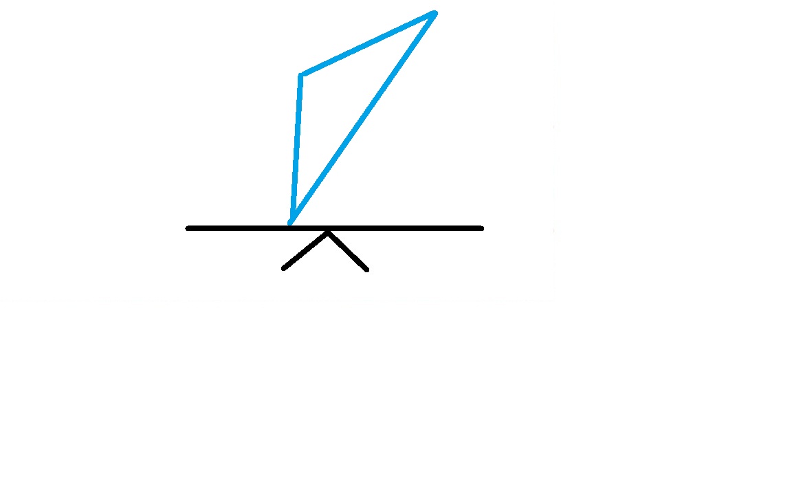


Image 5 
 
The plane's wings are equally spread across the image and on an upper horizontal third and the wheels and tail flaps on a lower horizontal third gives this image balance.
Image 6
 
Though there is 1 main subject, the tree is also key to the overall image. I think that because the girl is just off centre there appears to be an in balance with the tree which is close to the right hand edge of the frame, however I feel overall the image does work. I wonder what others think, feel free to comment
 
Exercise Learning's
a) Images can work well because they are balanced because there is almost a natural harmony to the image which the eye and brain find comfortable
 
b) Some images can be obviously balanced and some less obvious
 
c) Image 6 shows how that even when an image is obviously imbalanced the image call still work. Perhaps in this image this is the case because the girl is nearer the bottom of the image then the tree to right and therefore seems to exert more "weight" within the image. Perhaps my scales aren't quite right, what do you think?
 
d) This has been a very interesting exercise (especially as its been a learning activity without the camera) since sometimes as this images show that when I've taken an image it felt balanced within the viewfinder for reasons I may not have fully understood but I have felt it was a good image. Examining the balance in this way perhaps confirms the reasons for this.
 
e) What I will do in the future is from one scene take several images and using the virtual scales create 1 balanced image and several imbalanced images. I can then compare these to see if the the balanced image is indeed the best....I expect that as always there are exceptions to balance in terms of what makes a good image


TAOP Part 1 - Exercise 5 - Focal lengths and different viewpoints

TAOP Part 1 - Exercise 5 - Focal lengths and different viewpoints

For this exercise I've taken below 2 images and different focal lengths on 2 different lenses and at different camera positions

Image 1


Not my house! I've taken this at 135mm on a 70-300mm lens which at the distance I was at about 40 yards could fit the house within the view finder. Interestingly though the right edge of the building is almost vertical the left hand edge seems to lean off vertical to the right slightly. Is this due to the plane of the sensor / camera not being 90 degrees to the floor I wonder. This image could be part of a set for an estate agency.


Image 2


This was as close as I could get and presents the house in the frame almost as the same size as image 1. Due to using a 20 mm lens and my close up position I've had to tilt the plane of the camera / sensor to capture the whole of the house which has made the house look as if its leaning back. This image could be used if wanting the house to look imposing


In the first image the viewer would not necessarily know how close the camera was to the subject and therefore not know if a lens has been used to zoom in closer to the subject, as in fact it has. In the second image the camera was a lot closer to the wall than it looks in the image and the house looks more imposing and gives a feeling the viewer  / photographer are looking up at the house.

Exercise Learnings
a) at a different distance between lens and subject where using different lens to make the subject fill the frame will not necessarily create the same final image

b) the sensor and camera plane need to be at 90 degrees to the floor or subject to help reduce converging lines, where this is wanted

c) an ultra wide angle lens will often result in an image with converging lines

d) lenses with or at different focal lengths and different distances to the subject can be used to create images with different effects. Understanding what these are will help ensure the visualised image becomes the one captured.

e) different focal lenghths and different distances from the camera to subject will result in different scales of perspective and converging lines

f) the position of the camera in a vertical plane will also make a difference, to create an image with the 20mm lens similar to that in image one I would have had to have been about 8 - 10 feet taller.

Monday, 20 August 2012

TAOP Part 1 - Exercise 4 Focal Lengths

TAOP Part 1 - Exercise 4 Focal Lengths

This exercise is about the angle of view which changes subject to the focal length of the lens.

For this exercise I've used a 28-105mm zoom lens. All images are taken from the same spot with the camera on a tripod. A set of images have been taken with the camera zoom used at its widest and then through to its longest focal length to demonstrate how the image in the frame can change. All images have been taken with the the black crane as the point of focus

Image 1 - 28mm


This image is at the widest setting of the lens, 28mm. Unfortunately I've not captured much in the foreground but what I have done using this lens is to capture the expanse of the water and the perspective f nearby buildings and the blue but semi cloudy sky. A sense of scale is given to the viewer at this focal length. At this wide angle the black crane is hard to make out. The left hand side of the image shows the Docks walkway. Can you notice the big fluffy cloud just above and between the 2 large sets of buildings.


Image 2 - 46mm


The lens has been zoomed in at 46mm and the walkway is not out of the picture and without this the viewer could be mistakenly led to think the image was taken on the water, perhaps from a boat. Immediately without this dark walkway (it was in shadow) the overall image appears lightened. The closer zoom shows a bit more detail of the crane and the mid ground boats are more easily identifiable


Image 3 - 60mm


At 60mm the focal length is increased and the angle view is become decreased so that the blue sky is now hardly visible and the quirkiness of the fluffy cloud hard to identify as it was in Image 1. Figures are not more visible but noticeably the expanse of water now takes up less of the image and becomes less dominant than in the other images. Shadow on the building from the sun's position on the left of the frame is now more visible.


Image 4 - 80mm


The lens now has a focal length of 80mm and any element of blue ion the sky is now no longer visible. Figures are now more visible, person in white sitting down bottom left, person in orange walking bottom right and person in white on boat bottom far right. Looking at these images now I realise I've made a careless mistake in that my camera position has result in the white dome of the lamppost in every image covering the crane, the focus subject of this set of images. Ordinarily I would re-shoot having identified this mistake but I think I will leave this as reminder that obvious and careless mistakes can happen quite easily.


Image 5 - 105mm


At 105mm, the longest focal length my lens has I'm unable to really show the crane as the dominant element in this image.  The woman in orange on the right of the crane walking towards it is seen looking at the crane and this would help the viewer focus in on the crane. If had wanted to make the crane more dominant in the image I could do this a number of ways:

a) use a lens with a bigger focal length to zoom in closer on the subject
b) move the camera nearer the subject though this does change some elements of the image as a result of the camera to subject distance being shortened
c) In post processing use zoom crop. The level of accurate focusing will be identified when this is done. The next image demonstrates a zoom crop.


Image 6 - Zoom Crop


A zoom crop as part of post processing has enabled me to zoom in closer on the image having already reached the zoom limit of my lens at 105mm. In this image the crane can be seen as more dominant and the lady in orange to right can be seen focusing her attention on the crane, helping the viewer do the same. In addition to my mistake of taking this image with the white light dome in front of the crane, a perhaps undesirable litter bin can also be seen.

Exercise Learning's
a) The focal length of a lens, and/or the focal range of a zoom lens will change the angle of view that can be captured within the frame.

b) Elements of an image can be isolated by changing the focal length of a lens, this can have both positive and negative effects depending on the photographer's image design and visualisation.

c) The subject within an image can be made stronger not only by it becoming a more dominant element of the image if zoomed in upon, but in the case of image 6 by being the subject of attention of a passer-by also captured in the image.

d) The focal length selected with the lens is not just the only way of making a subject being in the frame, moving the camera nearer or performing a zoom crop as part of post processing can also achieve this

e) Concentration must be maintained in photography composition basics, in performing this exercise the inclusion of a lamppost over the subject was a big mistake. How did I do this - It was not immediately visible from my eye or when composing the frame at its widest :)

Sunday, 19 August 2012

TAOP Part 1 - Exercise 3 - A Sequence of Composition

TAOP Part 1 - Exercise 3 - A Sequence of Composition

For this set of images I've gone to Symonds Yat West and to the the River Wye where boat trips are organised and decided to make this the subject of my image sequence.

In this set of images I've focused less on thoughts of composition and lighting etc and instead captured what instinctively felt right.

I felt this image as the starting image gave a good indication of what the image set was about.


The happy Captain of the boat undertaking the river trips welcoming potential customers. This image again is a good starting point for the set of images and is one step forwards as he stands next to the board shown in the first image.This was actually taken toward the end of the set but felt better having it in the beginning when I considered the flow of images


Empty berthing slot and the walkway to the boat when it arrives. Using visual language it indicates the boat is not ready and there will be a wait. It could cause viewers with logical minds to question why the Captain is in the earlier image but I am still happy with this flow


Waiting.....for the boat to arrive and allow boarding


The boat's not here yet but perhaps its arriving....the children excitedly point toward the boat

It appears that someone forgot to secure the boat....

...however local staff quickly recover the situation.


This image shows people walking across the gangway over the water and on to the boat

In this image it focuses on the people actually on the boat and getting ready to find a seat


People in this image are now seated

Though its clear that adults and children all find that the best seats are at the back of the vehicle they are travelling in, on a sunny day this choice of seat in the open air appears an even better choice

I continue to let the sequence of events unfold and the next logical step with people on board is for the boat to start its journey. Showing just the front gives the impression the boat is moving from right to left and I continue this theme in the flow of images

In this image the boat trip has more obviously begun


Here the boat is clearly moving past the position of the photographer and an image of just the rear of the boat helps this though be transferred from photographer and his image to the viewer


This image further impresses on the viewer that the boat has left its starting position and that the are other users on the water. Driving on the left it appears is a rule for boats as well as cars


While waiting for the boat to return I show in these intermediate images other water users


Faster going with the water current emphasised by the positioning of the subject within the frame

This image in contrast to the canoeist where motor power is seen to be able to generate faster movement than what can be created by hand


In this next image showing the boat further away implies it is travelling fast


These lads highlight the fact the man power can be tiring and are having a rest. The smile on one face shows its an enjoyable hobby.

To conclude this set of images I now take some images of the boat returning back to its mooring position


This image continues the progression of the boat to docking at its birth and preparing for the passengers to disembark

I've taken this image to show the boat has docked and the Captain and his assistant assist the passengers to leave the boat ....


...and cross the gangway to return back to shore


Exercise Learning's

a) This was enjoyable and I can see how how a story can be told in a set of images. I'm sure with a careful selection of images that the story can be told without using words, much like reportage photography

b) I think I would have like to get closer to the people so that the viewer is better engaged with the subjects on the set of images. Surprisingly I felt uncomfortable about taking images of people like this though no-one objected. Perhaps in future I could also ask if they mind me taking images of them, explaining why of course, as this may allow me to get the subjects more engaged in the image and importantly the viewer can get a better connection. A good learning for this exercise

c) I can see how easy it is to focus on the taking of the images but not give full attention to all the mechanics of what makes a good photograph. This is something for more to give further attention and concentration to going forwards when doing reportage photography

d) There can be a lot going when when taking a set of images and it can be easy to get distracted and forget the focus of the set.

e) A decision may sometimes need to be made of whether to include a star, middle and end section to a set of images. In this case I wanted to tell a story so on this basis it seemed sensible to include these 3 aspects. I can see that in some reportage photography that this may not be achievable or desirable. However a conscious thought of what is wanted is good to have at the start

TAOP Part 1 - Exercise 2 - Object in different positions in the frame

TAOP Part 1 - Exercise 2 - Object in different positions in the frame

A very simple set-up for this exercise using a static subject, in this case a plum, and snooker table and natural light (to create some shadow) combined with diffused flash. I've specifically avoided an external set of images and created something very simple so that frame positioning would be completely focused upon.


Image 1 - Quick image


My natural instinct is to place a subject like this on what I would call a "zing" point, an imaginary intersection point where the horizontal and vertical lines on a one third and two thirds would cross as this would naturally appear to have more balance. This is the only thought I've given. Looking at the image I think the plum is placed too high and appears to be falling through the frame


Image 2 - Central Position


This central position gives the subject equal distance around it within the frame and would appear balanced but because of this it feels in natural and too contrite


Image 3 - A little off-centre


In this postion the plum again appears to be falling through the frame a bit like image 1 and in this image I think it is too high


Image 4 - Close to an edge


In this image on a bottom right zing point the image has more balance and is perhaps supported more by the bottom of the frame as opposed to images 1 and 3, and the shadow from right to left is better than left to right in this position. I think this image is the better of the set for these reasons


Exercise Learnings

a) An initial inclination when taking an image of a single subject may be to put the subject in the centre but this can appear to be too forced and un-natural

b) Use of the zing points on intersecting vertical and horizontal thirds can give a single subject within a frame for balance within it. Though its the focus of the image, it doesn't need to sit in the middle of the image to be noticed

c) A subject can appear to gain "support" from the edges of a frame. In this set of images security from the bottom edge of the frame  can appear to support the subject, as per image 4. WIthout this the subject can appear to be falling through the image as in images 1 and 3

d) Position of the subject within the frame can very much depend on the subject itself. For instance had the subject been a plane and the background the sky, the plane would seem more natural closer to an upper edge, as per image 1 and had the plane been flying from left to right then have more of the image to fly into wouild also give the image a more nataural feel

e) Though this set of images can appear to be boring and uninteresting I'm glad I chose such a simple set-up since for me I feel I've learnt much more about positioning within a frame. In future when composing a shot I will give this much more thought and since in a digital world take several images of differeing positions to consider what is best later. However I think I will avoid plums and snooker tables in the future


Sunday, 12 August 2012

Injury

Diasaster - Despite being a regular visitor to the gym and doing a normal 1 hour / 12km row I got off the rower Friday and my back was rather sore - very unusual. Walking around like an old man Friday eveningh. Sat morning took me 30 mins to get out of bed, lower back is agony. It will of course be better in a week or 2 but I think my photography goes on the back burner for a bit...what a shame :(

Wednesday, 8 August 2012

Thoughts so far

Thoughts so far....

I have completed my reading of Michael Freeman's book "The  Photographer's Eye" which I have found very informative, is well exampled and structured and is easy to read. Its a really good book which I will continue to go back to.

I have been referring back to this when doing the exercises so far to help validate my understanding and remind myself of what I am learning to ensure I am fully comfortable with it and of course incorporate into my photography more and thats the plan!

In looking at Michael's images he uses as examples, and I am sure these are historic images, I am wondering whether I'm focussing to much on the excercises and not sufficiently enough on the images I'm creating for example I think only the images I created for "Focus with a Set Aperture" are of a quality I would normally expect to produce.

I think for the momoment I will at least continue with a very strong focus on the excercises ensuring I fully understand and incorporate what I am learning into my photography, but I will try to give a little more thought to the images themselves, especially as I lead up to the first assignment